Color Vision And CI
A lot of CI systems provide visualisation in forms of grids, heavily relying on color to communicate the results of the tests. The most popular mapping seems to be green for a success and red for a failure, which is unfortunate as red-green color blindness is the most common kind. With large enough user base it becomes extremely likely that someone will have hard time making sense of CI’s output.
I was lucky that one of the users of intel-gfx-ci.01.org sensitized me to issue of being too reliant on colors alone.
Since Tomi and me could not easily change grid shape, the idea was to add texture. This way the cells with similar brightness, which could easily blend together if the colors were indistinguishable, also differ in another way.
There’s plenty of online simulations and explanations how different kinds of color vision deficiency look like, but we worked with full desaturation for local testing.
We went with diagonals in different directions (top-left to bottom-right and top-right to bottom-left) for failures and warns, dotted pattern for skips and T for timeouts, which we get rather seldom. Incompletes, not runs and crashes differ enough in brightness to be distinguishable without any extra features.
Our legend and grid, both in color and monochrome:

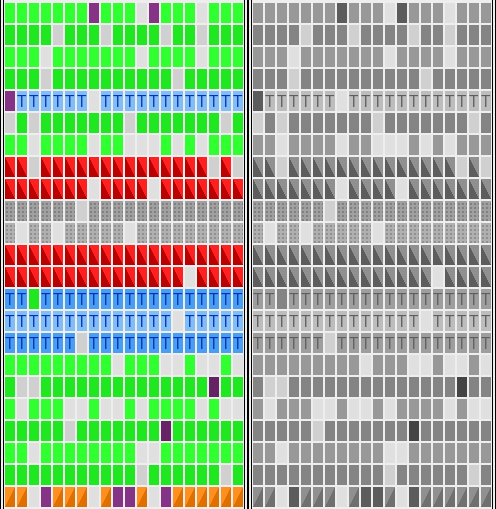
For web, those patterned effects are quite easy to achieve with modern CSS and gradients:
.dots  {
  background: linear-gradient(91deg, #b0b0b0 2px, transparent 1%) center,
              linear-gradient(#b0b0b0 2px, transparent 1%) center, #a0a0a0;
}

.diagonal {
  background: linear-gradient(to right bottom, #ff9020 50%, #df7000 50%);
}
After initial roll-out we have got more feedback from affected people, and with few iterations, the final result seems pretty solid.
There’s still room for improvement. If you have any suggestions how to make the results even easier to read, please do share, as there are many variants of color vision deficiency and all simulation methods are just approximations.